Hero with search
General Introduction
Give your candidates the option to search for specific jobs right from the moment they enter your JobShop. You can also use cards and quick links to point to other interesting content in your JobShop. This module is particularly well suited for use right at the top of your JobShop homepage.
Display
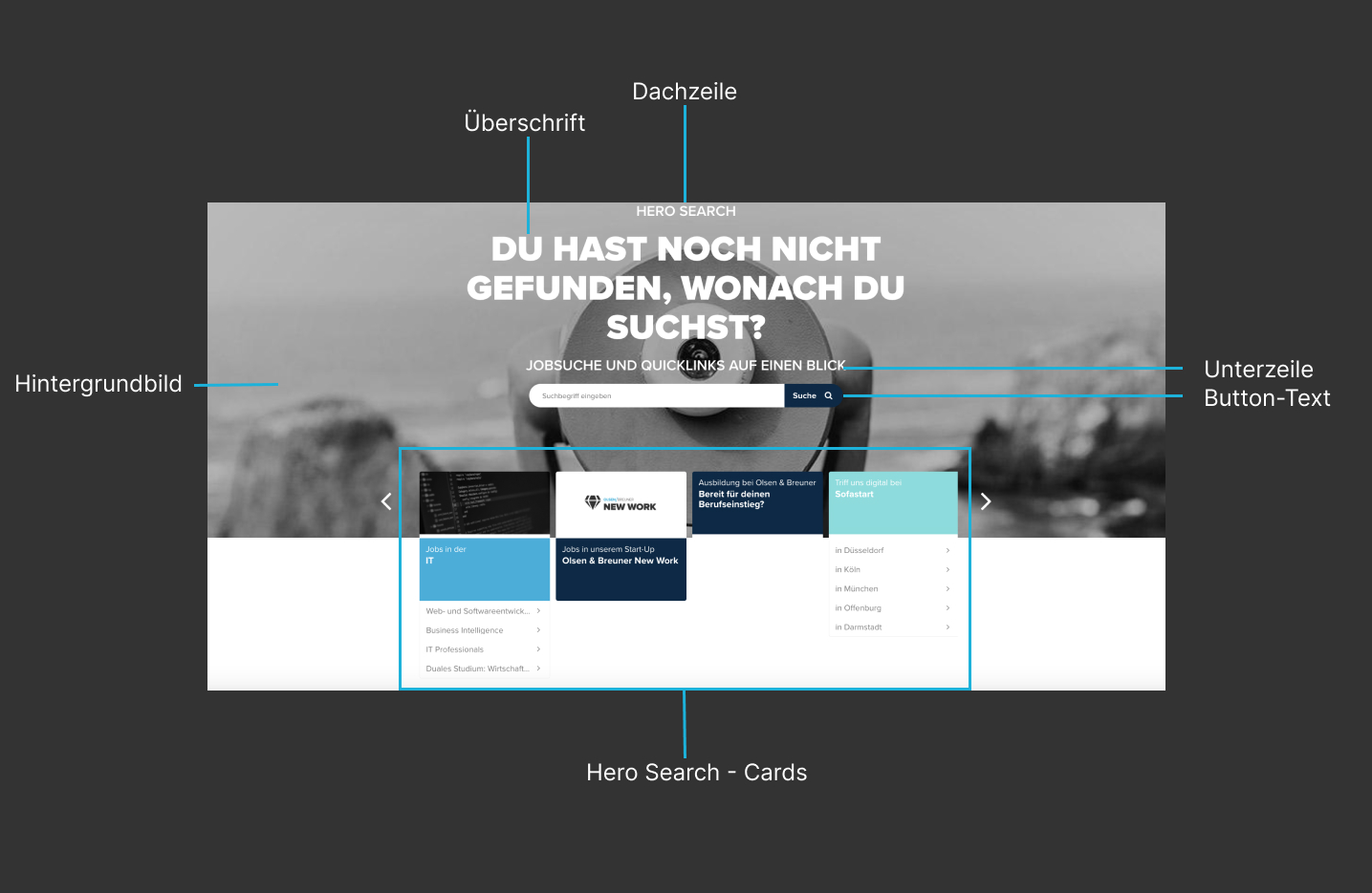
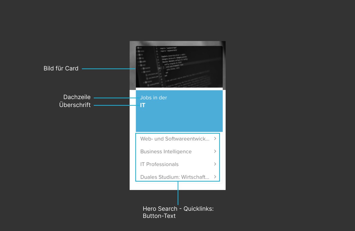
Editing in talentsconnect home
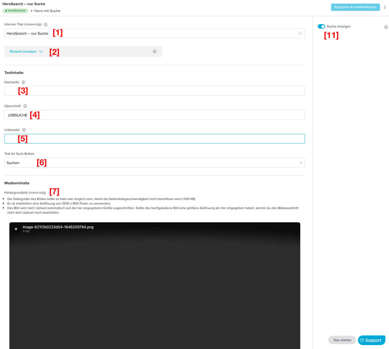
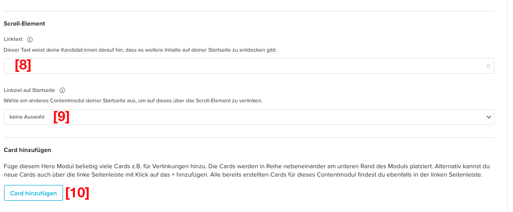
| Field name | Description |
|---|---|
| [1] Internal title (required) | This title is not displayed in the JobShop. It is only visible to you and helps you organise, sort and edit the various content modules. |
| [2] Show example | These images show an example of the visual appearance of the content module and serve as orientation and guidance when creating and editing a module like this. |
| [3] Eyebrow text | Also check the examples for the content module to better understand where this text is displayed. If you don't customise this text, your candidates will see "Start your career now". |
| [4] Heading | When this content module is placed right at the top of your homepage, the heading is used as the so-called H1 heading. It should therefore contain all important keywords (e.g. "Find your job at company XYZ"). This ensures that both your candidates and search engines correctly classify the content of the homepage and your JobShop. If you don't customise this text, your candidates will see "Start your future." |
| [5] Subheading | Also check the examples for the content module to better understand where this text is displayed. |
| [6] Text for search button | e.g. "Search" Recommended: Max. 30 characters |
| [7] Background image (required) | The file size of the image should be as small as possible so that page load speed is not affected (<100kb). We recommend using a resolution of 1200 x 800 pixels. |
| [8] Link text | This text lets your candidates know there is more content to discover on your homepage. The button text should clearly describe the action candidates can expect when they click it. The text should be as short and concise as possible (e.g. "learn more"). If you also add cards, the scroll element will no longer be displayed due to the available space. Recommended: Max. 30 characters |
| [9] Link target on homepage | Select another content module on your homepage to link to it via the scroll element. A link is of course optional. If you don't select a link, the scroll element is simply displayed as a visual hint. |
| [10] Add card | Add as many cards as you like to this Hero module, e.g. for links. The cards are placed side by side in a row at the bottom of the module. Alternatively, you can also add new cards via the left sidebar by clicking the +. |
[11] Show search | When enabled, candidates can search for jobs using a search field. If the search field is not displayed despite being enabled, please contact your talentsconnect contact person. An additional setting may need to be configured for your JobShop. Default: enabled |
| Field name | Description |
|---|---|
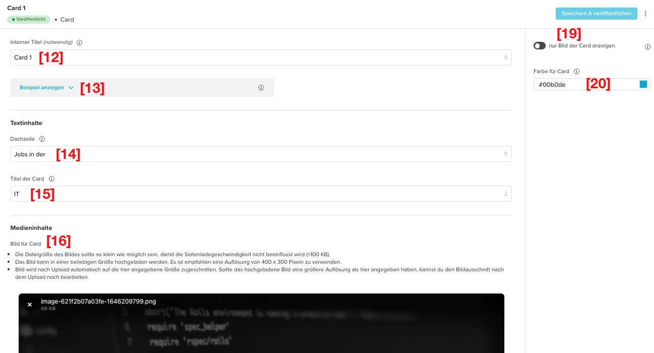
| [12] Internal title (required) | This title is not displayed in the JobShop. It is only visible to you and helps you organise, sort and edit the various content modules. |
| [13] Show example | These images show an example of the visual appearance of the content module and serve as orientation and guidance when creating and editing a module like this. |
| [14] Eyebrow text | Due to the limited space available in the card, the eyebrow text should be kept very short. Also check the examples for the content module to better understand where this text is displayed. Recommended: Max. 30 characters |
| [15] Card title | Due to the limited space available in the card, the card title should be kept very short. Also check the examples for the content module to better understand where this text is displayed in the card, e.g. "Marketing". |
| [16] Image for card | The file size of the image should be as small as possible so that page load speed is not affected (<100kb). The image can be uploaded in any size. We recommend using a resolution of 400 x 300 pixels. |
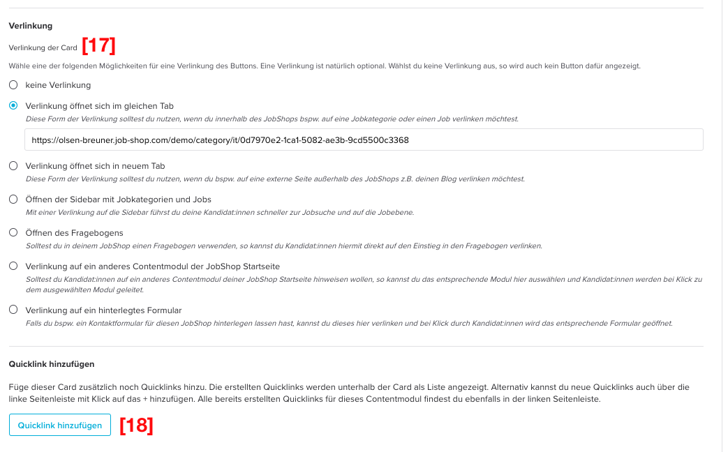
| [17] Button link | Choose one of the following options for linking the card. A link is of course optional. Options:
|
| [18] Add quick link | Add additional quick links to this card. The quick links you create are displayed as a list below the card. Alternatively, you can also add new quick links via the left sidebar by clicking the +. |
| [19] Show only the card image | If you only want to display the card's image, you can enable this here. The coloured area at the bottom of the card is then removed, and the text content is displayed directly on top of the card image. Note that in this case you should darken the image so the text remains readable. Default: disabled |
| [20] Colour for card | Here you can determine which colour the coloured area of the card should have. If you don't select an alternative background colour for this module, the primary colour set for your JobShop is used automatically e.g. #000000 |
| Field name | Description |
|---|---|
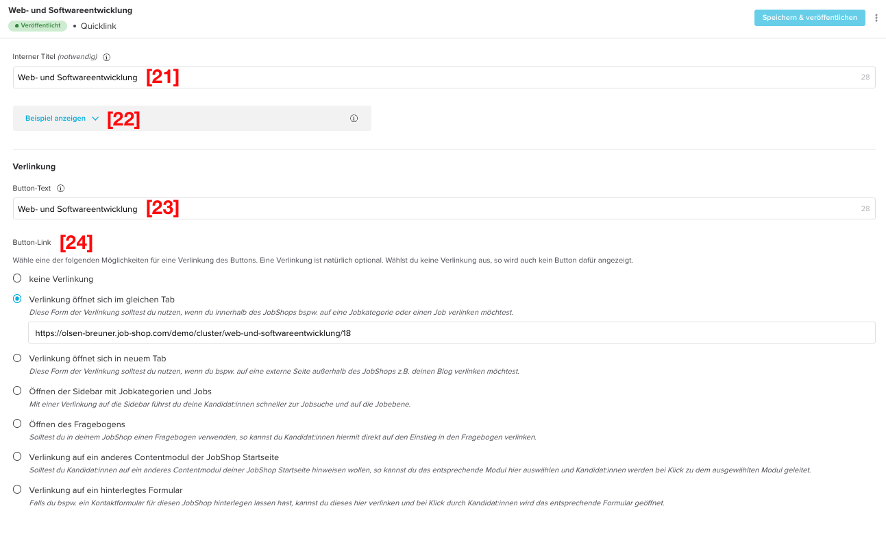
| [21] Internal title (required) | This title is not displayed in the JobShop. It is only visible to you and helps you organise, sort and edit the various content modules. |
| [22] Show example | These images show an example of the visual appearance of the content module and serve as orientation and guidance when creating and editing a module like this. |
| [23] Button text | The button text should clearly describe the action candidates can expect when they click it. The text should be as short and concise as possible e.g. Marketing, Sales, Production, etc. Recommended: Max. 30 characters |
| [24] Button link | Choose one of the following options for setting up a quick link. Options:
|
Was this article helpful?
That’s Great!
Thank you for your feedback
Sorry! We couldn't be helpful
Thank you for your feedback
Feedback sent
We appreciate your effort and will try to fix the article